Color Inspiration: A Nod to Nature
May, 30 2024 | 4 min read
By Kimberle Frost, Design & Color Consultant
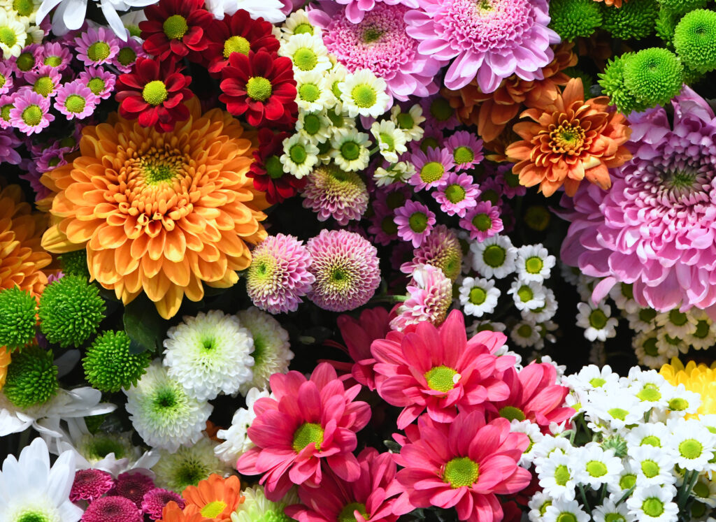
Daffodils pushing through the winter earth, a sign that spring has arrived, a blue sky tells us there is no need for an umbrella, and green grass tempts us to remove our shoes and enjoy the cool softness on our feet. Because of our increased desire to immerse ourselves in nature, the colors and textures we gravitate to are nature’s earthy, rich palette.
I LOVE color and the first place I go to for inspiration and reflection is my garden. Nature touches all my senses; I see the different patterns, color and textures in the everchanging landscape, I hear the loud chirps of the birds and the soft hum of a honey bee, my nose is filled with the sweet smell of lilacs and freshly mowed grass and savor the taste of fresh figs, lemons and rosemary. What more do I need to feed my soul and my design and color work?
As I write this, I’m watching the breathtaking gowns at the Met Gala and I’m thrilled to see that the theme of this years event is, The Garden of Time, which reflects our love of nature and all it offers. A BIG nod to nature!
Yellow: bright, warm, optimistic
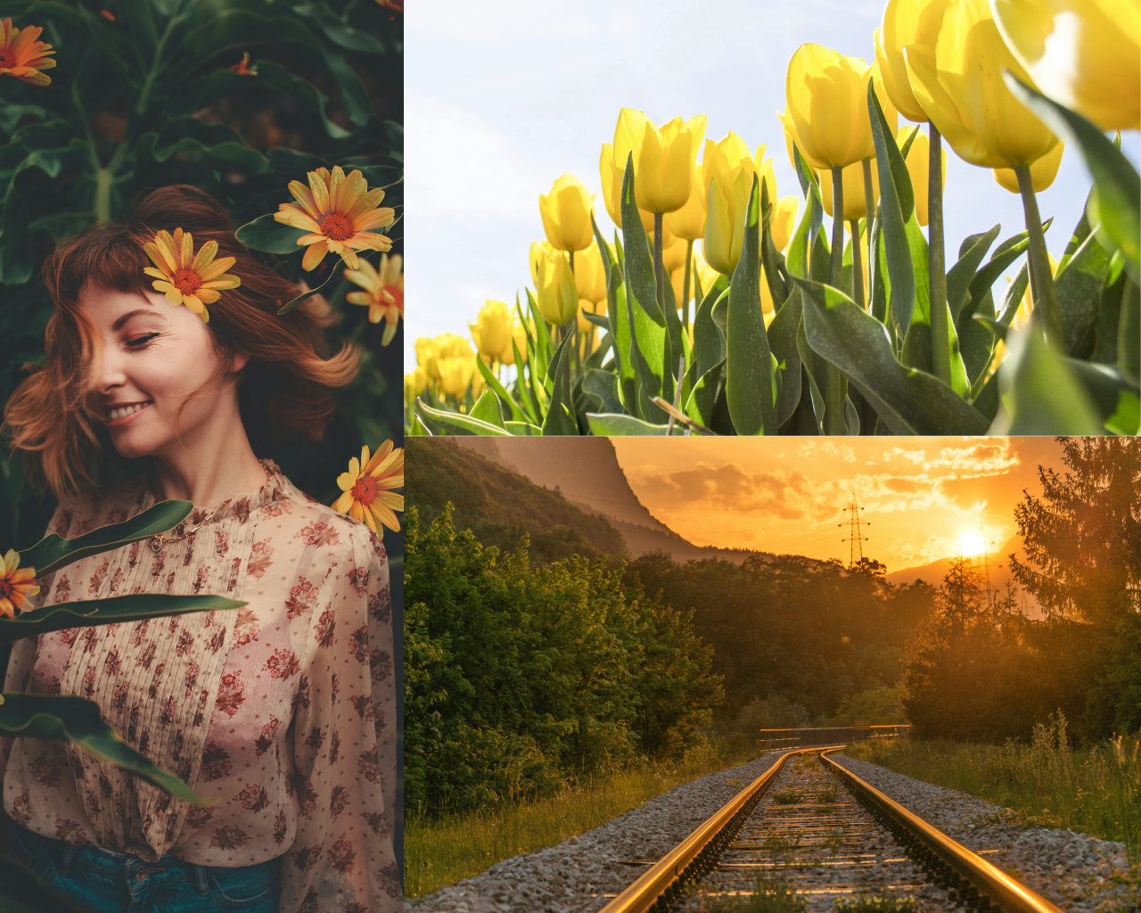
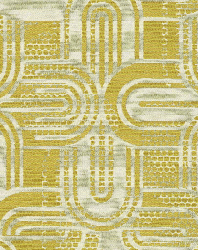
Let the sunshine in! There is no disputing the fact that yellow is one of the most beautiful colors in nature. Bright, vibrant yellow is a color that is usually hard to miss in nature. The color of sunlit daffodils and sunflowers, yellow and gold, are associated with warmth & optimism and is linked to sunshine, happiness and energy! Fall foliage turning yellow signals the change of the seasons.
As the summer equinox approaches, Yellow Day, the supposed happiest day of the year is celebrated annually on June 20th, coincidentally my half birthday. And a fun fact, in 1963, Harvey Ball came up with the idea of the iconic yellow smiley face symbol we all know today [and made even more famous in the movie, Forrest Gump]. He was paid only $45 for the moral boosting design.
Purple: culture – expressive
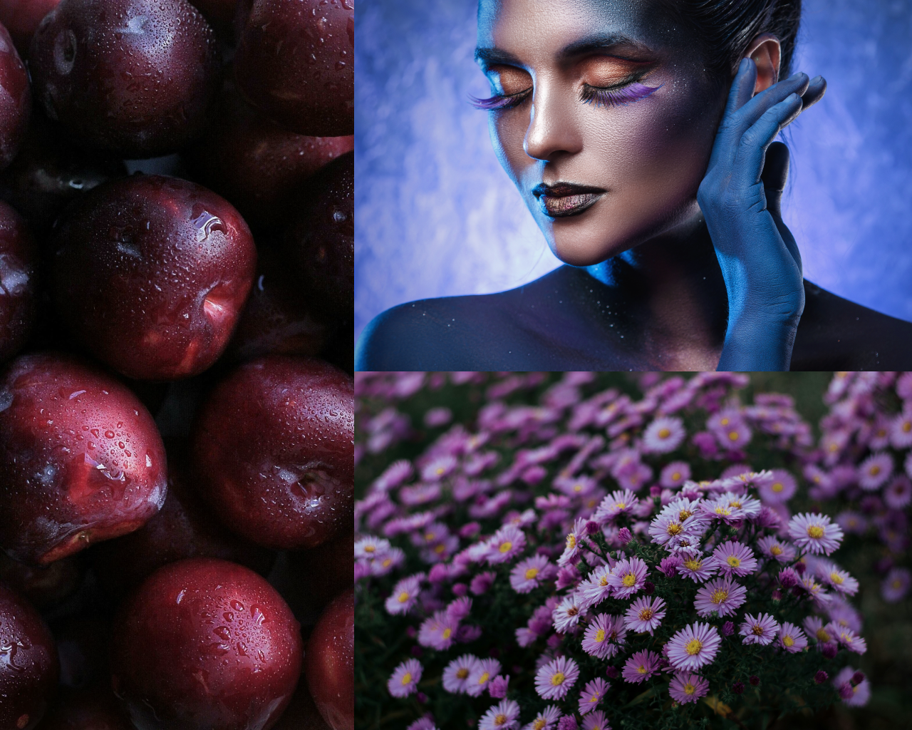
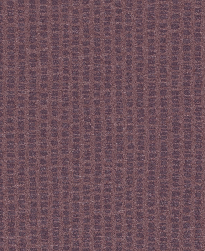
The color purple is everywhere in nature and depending on where you live, you’ll mostly see purple in flowers and birds. Purple arises when pigments absorb greens, yellows and oranges but reflect back red and blue light. Did you know that artichokes are actually a type of thistle, which means, that it should come as no surprise, that this plant produces bright purple blossoms. There are also other fruits and vegetables that share this beautiful hue, cauliflower, asparagus, beet root, eggplant, blueberries and black berries.
According to Pantone, enigmatic purples have been long symbolic of counter culture, unconventionals and artistic brilliance. Musical icons like Prince, David Bowie and Jimi Hendrix brought shades of purple to the forefront of Western pop culture as personal expressions and individuality.
Blue: confident – calm – carefree
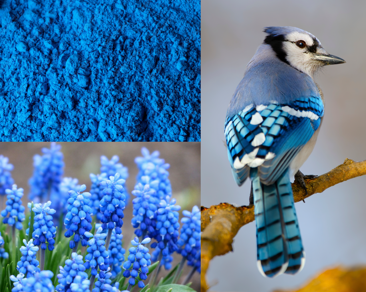

The colors most commonly associated with nature are green and blue. However, the actual blue is the rarest color in nature. According to an article in Nature & The Outdoors, the color blue that is found in food, plants and animals, lack a chemical compound that makes them blue, which makes the natural blue pigment rare. Blue colors in animals are not caused by chemical pigments but rather physics and the way light bounces off the surface. For example, birds like the Blue Jay, have a wing design that is quite scattered allowing only blue light to escape and give the bird its name.
Always intrigued by Shibori and indigo dyeing, at a recent workshop, I was surprised to find out, that even though we associate indigo as a rich, deep blue color, indigo dye is first green, then blue green and it gradually turns blue when it comes in contact with air.
Green: growth – balanced – lush
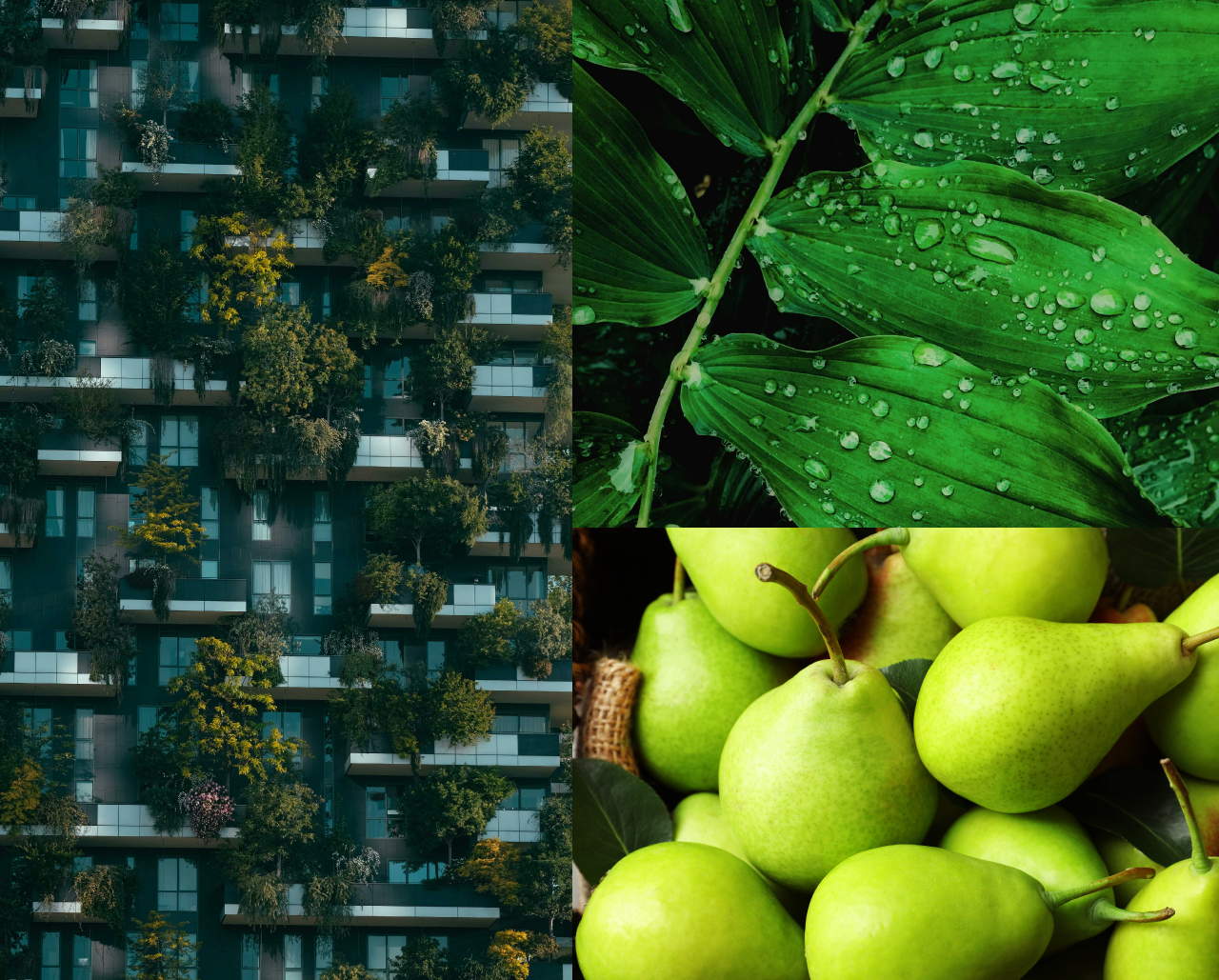

Did you know green is common in nature because of a complex chemical known as chlorophyll, which is involved in photosynthesis. Green is the quintessential color of nature and brings to mind lush grass, trees, leaves and forests. It can be associated with spring & summer and symbolizes growth, harmony, freshness, peace & fertility.
I always look forward to the first signs of spring. Inspired by the fresh green shoots that emerge in springtime, spring green symbolizes new beginnings and growth. In general, the green of spring leaves is fresher & lighter than deep hues of summer. The first recorded use of spring green as a color name in English was in 1766, referring to roughly the color now call spring bud.
Looking for a specific color or project inspiration? Find it within a few clicks using our ‘Colors’ filter or browse ‘Industry Insights’ for the latest in color trends.

About the Author
Kimberle Frost, an award-winning textile designer and colorist, has over 25 years of experience as an independent consultant offering services in textile design and styling, color consultation, and textile marketing in both the contract and residential markets. Frost is recognized for her broad range of design and technical expertise along with her strong color sensibility in woven and coated textiles, rugs, and hard surface finishes.
Frost formed her consulting studio in 1991, specializing in design, color, and marketing, and since has been engaged in a wide range of color and design projects. Her impressive portfolio includes work for highly regarded contract and residential companies such as Maharam, Designtex, Robert Allen, Mayer Fabrics, Wolf Gordon, Momentum, CF Stinson, Arc Com and Ultrafabrics.
She is a member of the Association for Contract Textiles and is on the advisory board for the Museum of International Folk Arts bi-annual design summit.
In addition to her textile work, she and husband, Chris, share a passion for craft and own a working ceramics studio and mercantile, offering daily classes and a charming shop filled with local and global findings.
Frost has two children and lives with her husband in New York. She loves to cook, entertain friends and family, and feed her passion for color and design through her extensive travels.