NeoCon 2021 Color Review
November, 2 2021 | 3 min read
By Kimberle Frost, Design & Color Consultant
I’ve been attending Neocon since 1986 [truth be told] and this is one of the first years where I actually had an opportunity to walk around and really take everything in and observe.
I couldn’t help but notice two very obvious details; fewer attendees, which made it easier to get a quick Starbucks, enjoy a less crowded elevator and have a long overdue conversation with friends and clients, and, most exciting for me, the presence of COLOR! You could immediately feel the energy in the diverse offering of pattern and color.
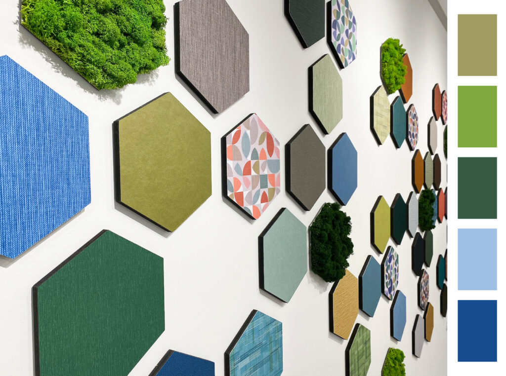
Green
“Study nature, love nature, stay close to nature. It will never let you down.”
Frank Lloyd Wright
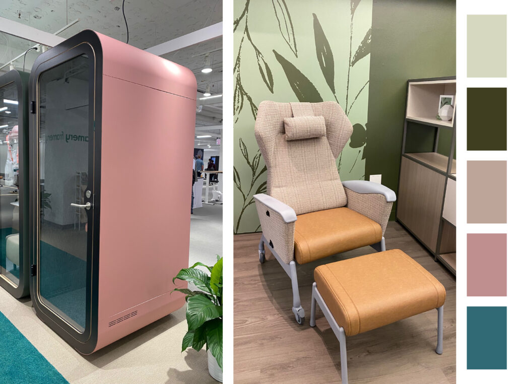
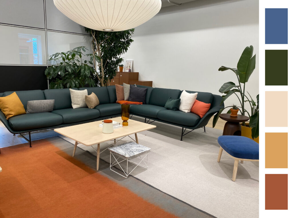
Biophilic interiors connect us with nature. It’s known to boost human health and wellness and create a calm environment. To support and celebrate this connection with nature, green, both yellow and blue based greens, were evident throughout the mart and in the city streets. From potted plant tucked in corners, to vast walls painted in green, natural lighting with soft minty accents, every shade of green helped bring the outdoors in.
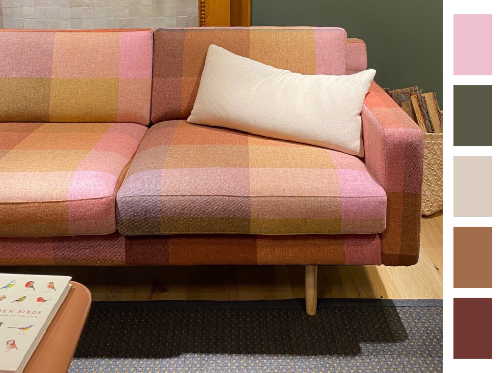
Pink
“My colors are blush and bashful. I have chosen two shades of pink, one is much deeper than the other.”
Shelby, Steel Magnolias
This year, Blush was found on everything from upholstered furniture, case goods to acoustical pods paired with deeper shades of rich raisin and blue grotto. One may ask, why is this shade still so prevalent in interiors? For one, it’s a soothing, sophisticated shade that works well with both warm and cool neutrals. It is also a color that we can all wear and live with, regardless of our sex, prompting its timeless appeal and attraction.
Warm Complex Hues & Neutrals
“You don’t need to see the sunset to feel the warmth of its colors.”
Atticus
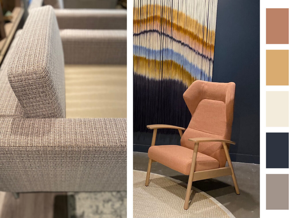
Although there was a fair share of cooler shades, especially blue and gray, a warmer color palette was preferred across all markets. Warmer based neutrals included ivory, taupe, camel and brown, colors that evoke a sense of security and coziness. Harvest Gold, Burnt Orange and Avocado green combined with saturated plum tones and subtle metallics, all colors reminiscent of the earthy tones of the 70’s era.
Pops of Color
“Color! What a deep and mysterious language, the language of dreams.”
Paul Gauguin
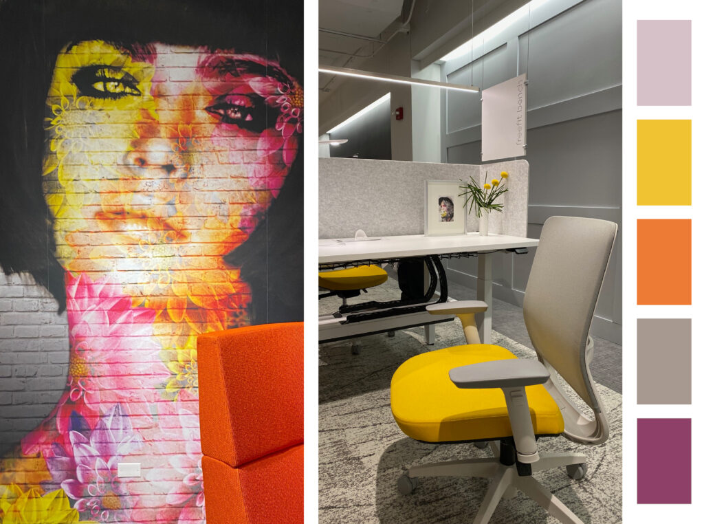
Against a neutral background, color was popping up all over. Think vivid pink, electric green, sunshine yellow, bright orange and cobalt blue, all statement colors that give off a happy, upbeat feeling. These joyful colors were striking in textured pillows, graphic wallcoverings, accessories and printed textiles.
In addition to color and texture, there continues to be a big push for products that can be confidently cleaned so I noticed the combination of cleanable woven textured patterns with solid/printed coated fabrics, not only for healthcare applications but also in our workplace environments.
The demand for acoustical fabrics, vertical and/or upholstery, is more important today as we change the way we work. These materials, whether made of natural or synthetic fibers, add a much-needed sound absorption layer to our common spaces.
Before we know it, it will be June 2022 and we’ll be back in Chicago to crowded elevators, refreshed showrooms and new faces. I look forward to it!
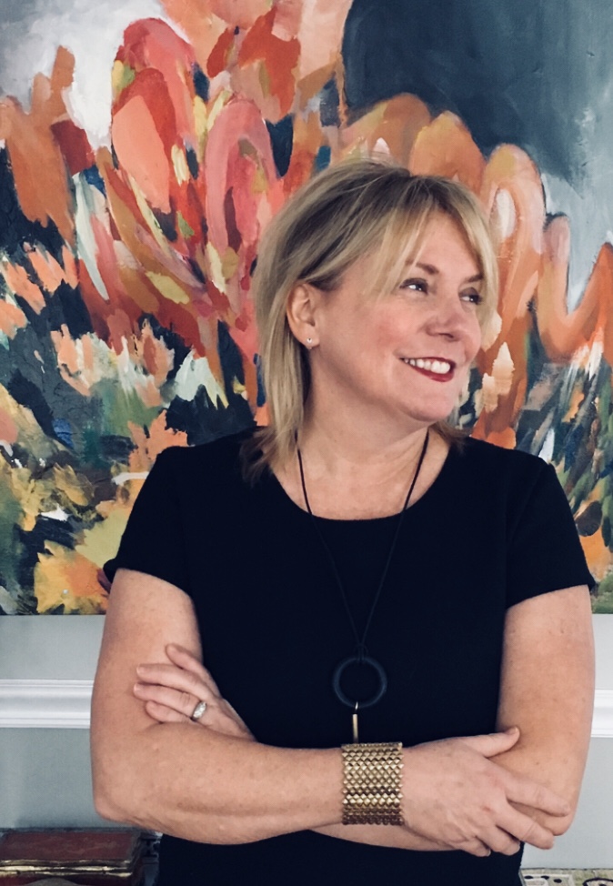
Author Kimberle Frost has over 25 years of experience as an independent consultant offering services in textile design and styling, color consultation, and textile marketing in both the contract and residential markets. Frost is recognized for her broad range of design and technical expertise along with her strong color sensibility.
Her portfolio includes work for highly regarded companies such as Robert Allen, Duralee, Mayer Fabrics, Momentum, Arc-Com, and Ultrafabrics. She was also Vice President of Design at Designtex for over 6 years where she was instrumental in shaping the design direction of the company. In addition to work with major jobbers and furniture manufacturers, she continues to contribute her design expertise and color vision to many domestic and foreign mill sources.

